JOURNAL
A Place in Colour
At Trentham Waters Resort, colour is more than a design choice — it’s an invitation. To exhale. To feel. To remember. Every hue across the property has been chosen with purpose, creating a sensory experience that’s as unexpected as it is unforgettable.
From the earliest stages of design, the team behind Trentham Waters made a conscious decision to move away from the familiar tones of traditional resort accommodation — the predictable neutrals, the “safe” palettes. Instead, they asked: What does it feel like to arrive somewhere completely different? And from that question, a colour story began to unfold.
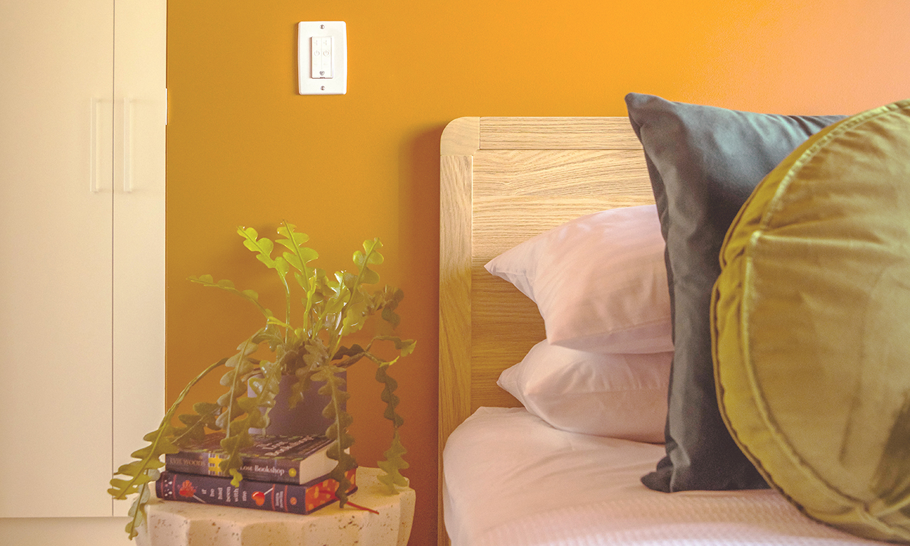
The resort’s villas and river retreats are dipped in expressive tones — from rich terracotta and rusted clay to chalky sky blues and sun-washed whites. These colours do more than decorate walls — they create mood. A sense of warmth. A sense of joy. A reminder of place, and of how it feels to be here: open, unhurried, and completely at ease.
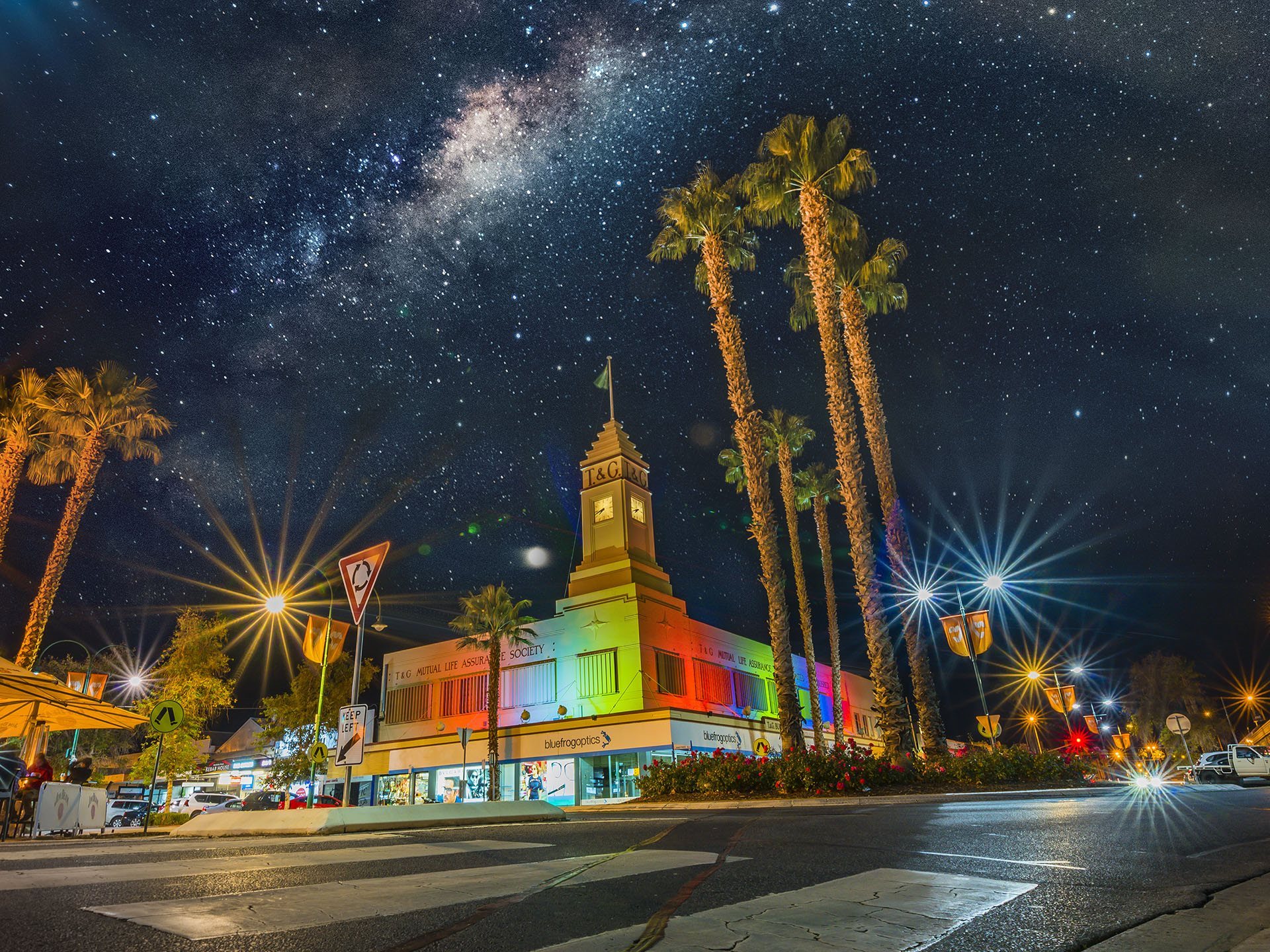
Palm Springs became a guiding light — not just for its iconic mid-century style, but for its celebration of colour as lifestyle. In collaboration with Melbourne-based Technē Architecture + Interior Design, the resort’s restaurant was brought to life in this spirit: a playful, polished nod to poolside glamour. Inside, bold tones and retro-inspired forms give the space its personality — thoughtfully considered for golden-hour dining and long, languid afternoons.
Even the pool towels, loungers, and umbrellas are part of the story — thoughtful colour moments that echo the feeling of summer. Nostalgic, bright, and joyfully unexpected, they’re details that stay with guests long after check-out.
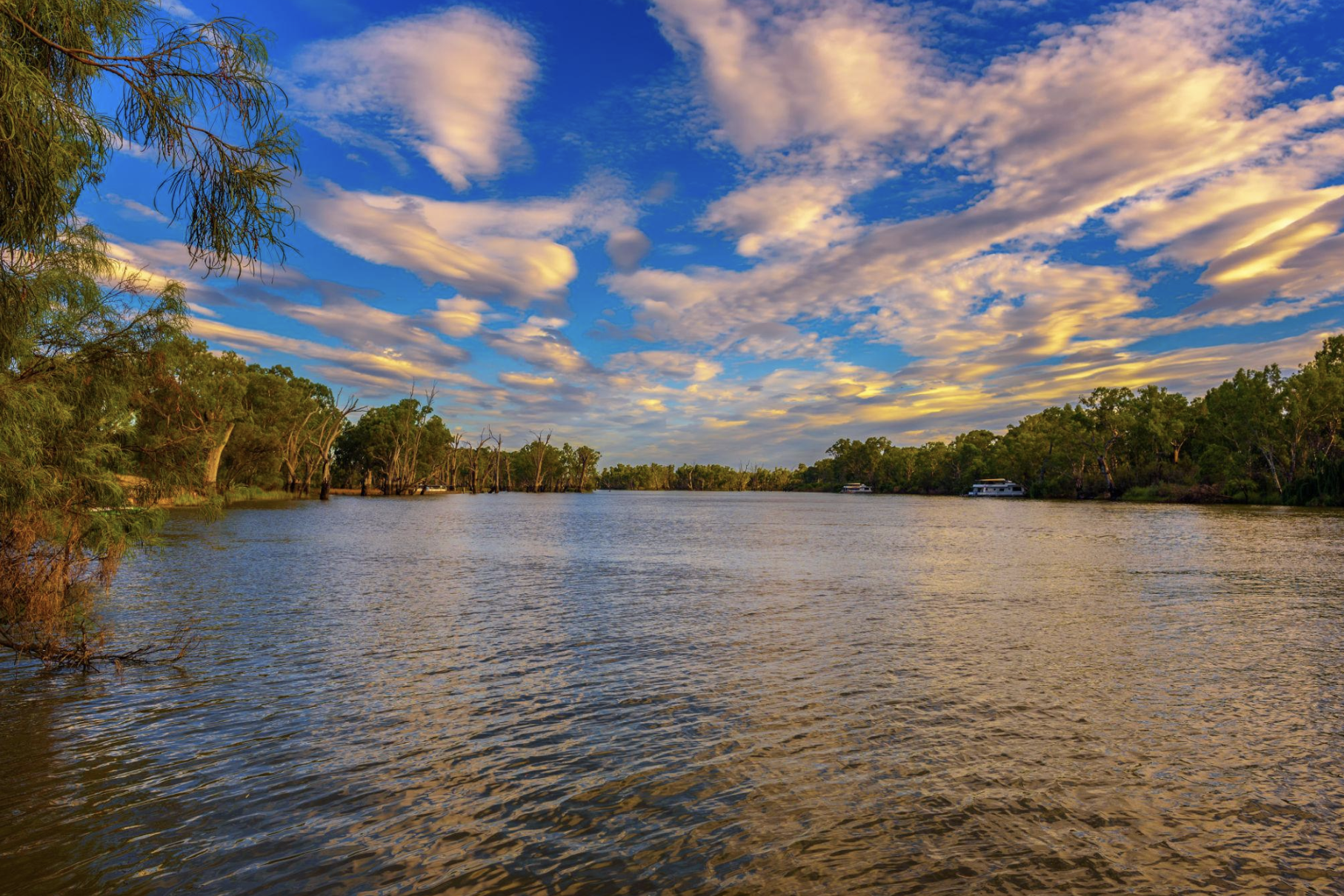
But for all its vibrancy, the palette still feels grounded. That’s because the team also drew deeply from the Mallee landscape itself — the warm red earth, the straw-gold grass, the silvery-green gums, and the ever-changing light of the Murray. The colours of the bush provided the foundation. The brighter moments simply layered over what was already there.
Because colour does more than fill a space — it creates feeling. At Trentham Waters, it sets the tone from the moment guests arrive: energising, soothing, surprising. The palette isn’t just about visual impact — it creates a kind of emotional architecture. A mood that lingers.
This is not a resort that blends in — and that’s the point. Every space, every corner, every colour has been designed to give guests something they didn’t expect. A fresh perspective. A lifted spirit. A stay that doesn’t just look good, but feels good.
At Trentham Waters, colour is memory made visible — and every shade tells a story.